Welcome to Compose. There's lots of stuff here, all about composing paintings.

Current entries appear in Dianne's weekly newsletter.


Saturday, April 29, 2017

Magic of Alternating Brushstrokes

Have you heard of alternation? A rarely discussed design tool, alternation can sometimes be the very method you need for moving the viewer’s eye through your painting, or making dull areas interesting.  It means a sequence of changes in direction. 
Here are some examples we see every day. 
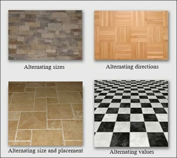
When painting, there are many ways to use alternation.  The most dynamic is alternating brushstrokes.  Among our contemporary painters, one who is a master of brushstroke alternation is Qiang Huang.  Let's take a look at his "Demo at Huntsville 2016 1"
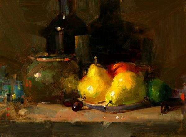
Here are two sections from Qiang's background.  Look at the alternation of stroke directions, then glance back at the whole painting and notice how those sequences of alternating stroke direction give movement to the painting.
Here's a similar analysis of Qiang's pear on the right. 
If you remove your attention from the imagery in Qiang's demo and focus only on his alternating brushstrokes, you will see how much energy just his brushstroke alternating gives to this piece.   

Tuesday, April 18, 2017

Keeping Colors Clean and Crisp

Often artists complain about their colors feeling dull or dirty and are at a loss as to what to do about it.   Dirty color is easily corrected by revising work habits.  Here are four suggestions that can go a long way towards getting clean, crisp color.
1. Constantly wipe your brush clean
Make a habit of holding a brush in one hand and a paper towel in the other. Any time you switch colors, wipe the brush by squeezing out excess paint with the paper towel.
Image
If you’re switching to a new color that’s much darker or lighter, don’t just squeeze out the brush—instead, rinse the brush, squeeze out excess moisture, and then dip into the new color. 
Image
You will discover that keeping your brush clean while working goes a long way towards giving you precise values and clear, crisp colors.  
2. Don’t skimp on paint
Too little paint often results in weak color. Load your brush with adequate amounts of paint to stroke the surface and avoid trying to stretch your paint by spreading it so thin that the texture of the surface comes through. Consider each stroke an expression, not an application of paint.
Image
3. Avoid over-stroking and over-blending
Start thinking of your brush as a tool to shape the paint, not just as an applicator of paint. This means slow down. Be deliberate with each stroke and avoid repeating a stroke in the same spot. Connect a new stroke to reshape a previous one, then move on to the next one somewhere else. Over-stroking and over-blending can flatten out and muddy up a color very quickly.  
Image
4. Find the right hue to lighten your colors
Do you reach for white each time you want to make a color lighter? Let's rethink that habit.

Adding white alone changes the color temperature, making the color look dramatically different.  Rather than automatically reaching for white, try to find another color that will give you the value change you need while allowing the color to remain in character. 

For example, notice the difference between alizarin crimson lightened with cadmium red light, then white as compared to alizarin crimson lightened with white alone.  
Image
White is among the most beneficial and versitile paints on our palettes, but learning to use it with other colors rather than as a crutch to lighten will go a long way towards keeping those colors clean.
Note:  This week's tip is a dusted off and polished redo from my Empty Easel article published in 2008. 

Saturday, April 8, 2017

The Problem of Muddy Color

No single color can be muddy. Mud happens in relationship to surrounding colors. If a vocalist sings a flat note or a guitar string is out of tune, the off-note by itself would not be offensive, but combine it with another tuned note or two and we cringe. The same is true for color. It requires a sour relationship to its neighbors to become muddy.
One way muddy color can happen is when the shadow values are out of context, meaning they don't relate chromatically to not-in-shadow values.  We see it especially in light colored images such as Caucasian faces, white vases and snow. The shadow colors in this child's face are muddy, causing the child's face to appear dirty.
The mud is caused by a poor chromatic relationship.  A chromatic relationship is a sequence of color values from light to dark (or dark to light) that follow how hue, value and intensity change as light on a shape moves into shadow or shadow to light. One doesn't simply add a dark color to create shadow.  That color should relate chromatically or it will not feel like shadow.
In this next version, there is no mud.  The chromatic relationship is right.

Thursday, April 6, 2017

The Color of Light

Below are azaleas from the same area of the bush, but under different colors of light.  Those on the left are on my dining table and on the right, on the azalea bush outside.  We might note here that the camera interprets the colors differently from how my eye sees them, nevertheless, it records something about how the color of light changes the color of everything it illuminates.
Image
Taking my experiment a bit further, I took four photos of one the inside blossoms.  For each shot, between the light source and the flower I held a different colored transparency, changing the light color. The changes are subtle, but seeing and translating these nuances can mean everything to color harmony in our work.
Image

Saturday, April 1, 2017

Getting to Know Color as a Language

What are these colors?
Image
If your answers are mauve, tan,and olive green, you are not speaking the color language
Begin here:  Color is a language within itself.  It has three major parts of speech--hue, value and intensity--as well as temperature which gets created by hue and intensity.  Once we get to know each of these components of color, we can create any color we want just by asking three questions.
    1.  What is the hue?
    2.  What is the value?
    3.  What is the intensity?
The questions can be asked in any order.  But what do they mean? 
Hue
Image
The color wheel was invented to help us work with hue.  We can recognize hue if we call it by its color name such as red-violet, yellow-orange, yellow-green.  We can know these like a parent knows the face of a child.  We can see them in our minds when their names are called.  Committing this to memory is the first step towards getting to know the language. 
Intensity
Image
 The intensity (or chroma) of a color is the degree of saturation of its hue.  The color wheel shows the hues at 100% hue saturation. An absolute gray has zero saturation.  When any hue's complement (the hue opposite it on the wheel) is mixed into it, the saturation decreases--becoming more neutral-- causing a lower intensity.  Complements neutralize each other just like an acid neutralizes an alkali.  Changing the intensity doesn't change the hue although it might change the value.  Note:  The labels intensity and chroma are interchangeable.
The swatches at the beginning are all reduced intensity.  The first one we might have called mauve is actually middle-intensity red-violet.  The easiest way to label an intensity is to use the words low(almost neutral), middle (slightly neutral) and high (highly saturated).
Value
Image
Value (also called tone) is the degree of light or dark within a color.  We show it in a scale to help discern it.  Unfortunately, color scientists have screwed up the numbering of this system.  Earlier systems use 10 to indicate the darkest value (that's the one I learned), but more recent systems use 10 to indicate the lightest value. 

The number matters only in so far is it helps to distinguish degrees of value.  A better way to communicate the language of value is to call it high(light), mid-tone(middle) or low(dark). 
And Here's How the Language Works
Image